
UX Case Study
Redesigning MBTA mTicket for the Fare Gate Era
How user research revealed that an app designed for conductors walking through train cars was failing riders rushing through fare gates.
TL;DR
The 30-second version
The MBTA mTicket app is the only way to buy mobile tickets for Boston's Commuter Rail. With new fare gates rolling out at major stations, every tap and swipe now happens under pressure, in crowds, with trains to catch.
After analyzing 50+ user reviews, I identified four core pain points: a 5-step ticket activation flow, payment friction on Android, zero real-time service info, and a confusing experience for visitors. Most fixes are low-effort, high-impact changes that could ship quickly.
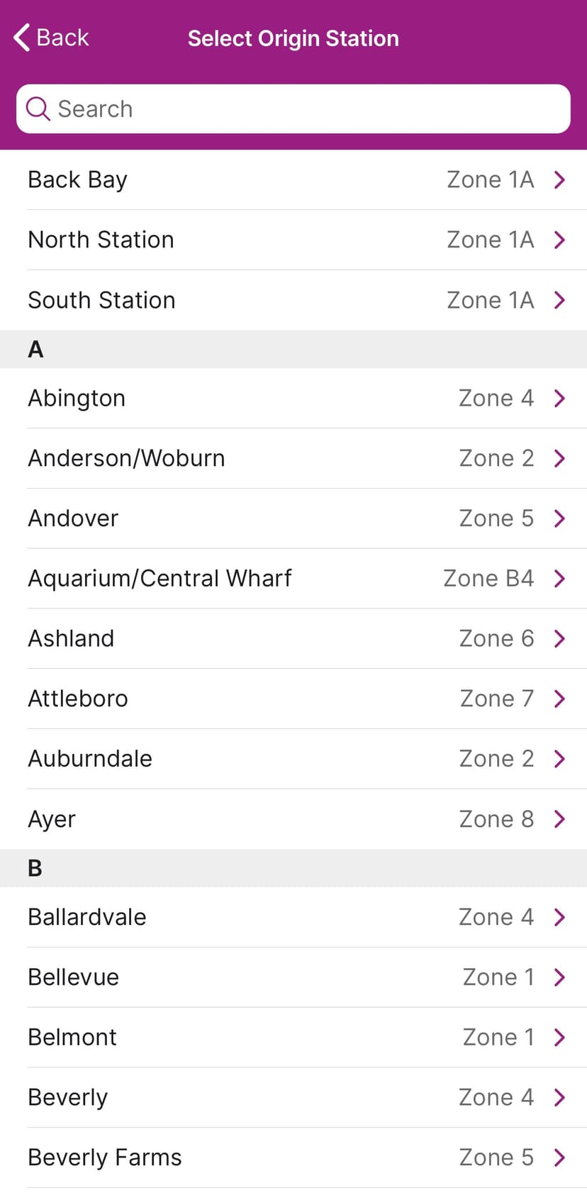
Interactive Prototype
Explore the redesigned mTicket experience. This prototype demonstrates the key UX improvements: flattened ticket wallet, smart route shortcuts, Google Pay integration, zone education for visitors, and contextual service alerts.
01. The Context
A World That No Longer Exists
The mTicket app launched in 2012, back when Commuter Rail conductors walked through train cars checking tickets. The workflow was simple: buy a ticket, show it when asked, done.
That world no longer exists. In October 2022, the MBTA installed fare gates at North Station. In December 2025, South Station followed with 40 new gates. Back Bay and Ruggles are next.
Now, riders must scan their ticket twice per trip: once to enter, once to exit. They do this while walking toward gates, often carrying bags, in crowded stations, with trains departing in minutes. Every second of friction multiplies across thousands of daily interactions.
"Some commuters use all the bad words for North Station's new fare gates."
Boston Globe headline, January 2023
02. Research Methodology
I analyzed user reviews from the Google Play Store and iOS App Store (2024-2025), supplemented by MBTA documentation and news coverage of the fare gate rollout.
I filtered out bug reports and outages (engineering issues) and focused on UX problems that persist when the app works correctly. I prioritized complaints with multiple corroborating reviews or high "helpful" vote counts.
What emerged were patterns: the same frustrations voiced by different people, months apart, often in strikingly similar language.


03. Meet the Users
Three distinct user types emerged from the research, each with different needs and pain points.
Sarah: The Daily Commuter
Financial Analyst, FraminghamTakes the 7:12 AM train to South Station five days a week. Uses monthly passes or flex passes. Android user. Her routine is tightly optimized, but the mTicket app is the one variable she cannot optimize.
Pain Points:
- Activating a ticket requires 5 steps, performed 10+ times per week
- Has to re-enter CVV every time she buys a new flex pass
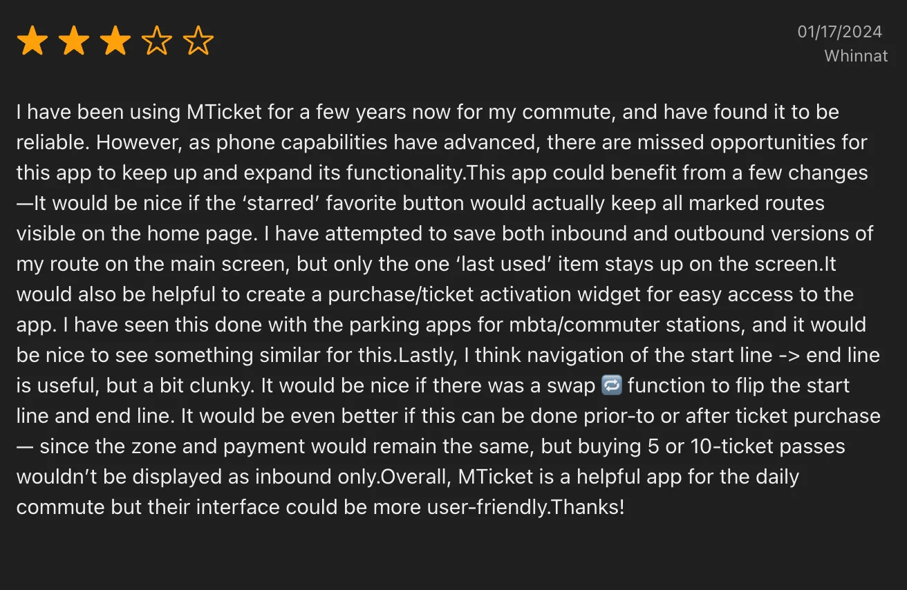
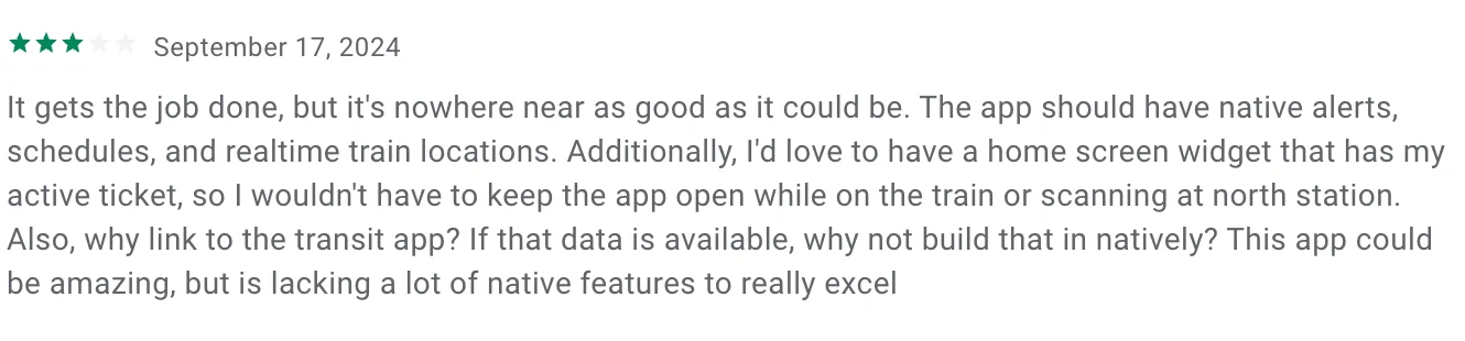
- No home screen widget means fumbling with the app at fare gates
- Favorites feature does not persist
"I do the same thing every single day. Why do I have to tap through four screens to activate a ticket I bought last week for this exact trip?"
Marcus: The Occasional Rider
Software Developer (Remote), Jamaica PlainTakes the Commuter Rail 2-4 times per month for concerts, visiting family, meeting friends. iPhone user. He builds consumer apps for a living and notices every UX friction point.
Pain Points:
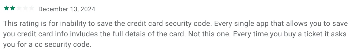
- Card info does not save reliably between sessions
- No map to discover stations or understand geography
- Zone system is referenced but never explained
- No real-time info to help decide whether to take the train or drive
"I opened the app for the first time in a month and had to re-enter my entire credit card. Not just the CVV. The whole thing."
Jennifer & David: The Visitors
Teachers from Ohio, First-time Boston VisitorsFour-day vacation, want to visit Salem for the witch history. Comfortable with technology but unfamiliar with Boston's transit system.
Pain Points:
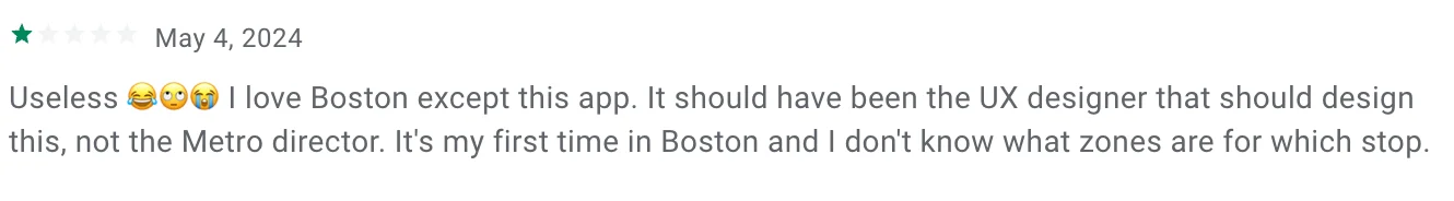
- App name suggests coverage of all MBTA services; it does not
- No map, no way to discover stations or see which terminal to use
- Zone system is confusing without explanation
- Android layout issues made the app nearly unusable
"We downloaded 'MBTA mTicket' thinking it would work for the subway too. We wasted 20 minutes trying to figure out why we couldn't find the Blue Line."
04. Pain Points & Solutions
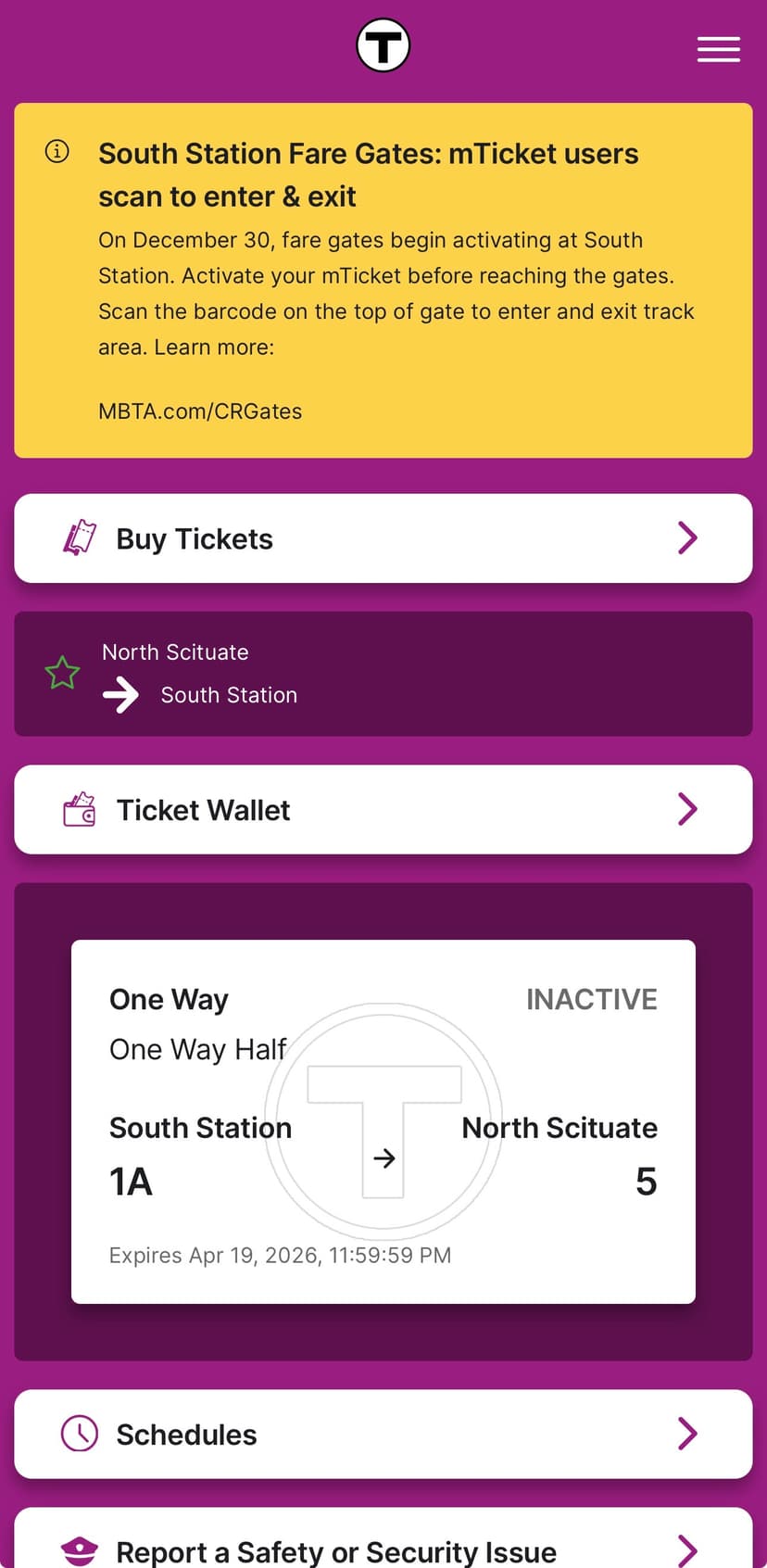
Pain Point 1: Ticket Activation Takes Too Long
Activating a ticket currently requires five steps: unlock phone, open app, navigate to Ticket Wallet, select the correct ticket, tap "Activate." In a fare gate environment, users perform this sequence while walking toward gates, often with bags, in crowded conditions, under time pressure.

Solution: Flatten the Ticket Wallet
For users with fewer than 5 tickets, eliminate the Ticket Wallet as a separate screen. Purchased tickets display directly on the home screen as cards with an "Activate" button right there. No drill-down required. See this solution in the interactive prototype above.
Pain Point 2: Purchasing Creates Unnecessary Friction
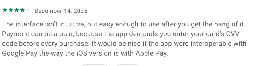
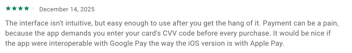
Buying a ticket involves multiple friction points: CVV re-entry on every Android purchase, no quick route selection for daily commuters, broken favorites, and no way to swap origin/destination for return trips. This issue has persisted for 4+ years.

Solutions
- Google Pay Integration: Parity with iOS Apple Pay, eliminating CVV entry through tokenized payment
- Smart Route Shortcuts: "Your last trip", "Return trip", and "Frequent route" as tappable cards
- Swap Button: One tap to reverse origin/destination for return trips
See these solutions demonstrated in the interactive prototype above.
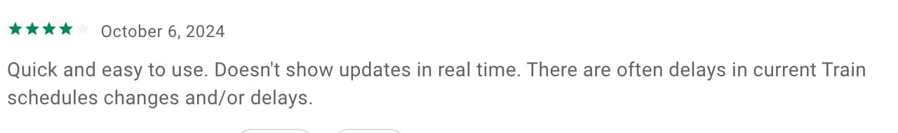
Pain Point 3: No Real-Time Service Information
The mTicket app displays static schedules only. When trains are delayed, cancelled, or rerouted, users have no way to know this within the ticketing app. They must switch to a separate app to check real-time status.
Solution: Contextual Alerts
Rather than duplicating a full tracking app, integrate targeted delay information where it matters: display route-specific alerts on the home screen as dismissible banners, show current status when viewing or purchasing tickets, and personalize based on the user's recent routes.
Pain Point 4: Poor Experience for Visitors
The app assumes users already understand Boston's Commuter Rail system. For visitors and new riders, this creates barriers: no maps, no zone explanation, unclear app scope, and no wayfinding help.
Solutions
- Onboarding Clarity: First-launch screen stating "Commuter Rail & Ferry Only" with "I'm a Regular Rider" vs "I'm Visiting Boston" paths
- Interactive Zone Map: Visual map showing all zones with color coding and station locations
- Zone Explainer: Contextual help button next to every zone reference
See these solutions demonstrated in the interactive prototype above.
05. Solution Prioritization
Not all solutions require equal effort or deliver equal impact. The prioritization matrix focuses on quick wins that could ship immediately while building toward larger improvements.
06. Metrics for Success
07. Conclusion
The mTicket app is not broken. It works. You can buy tickets, activate them, and scan through fare gates.
But "it works" is a low bar for an app that thousands of people rely on daily. The frustrations in the reviews are not about crashes or bugs. They are about friction that adds up over hundreds of uses. They are about an app designed for one era being forced into another.
The good news: most of the highest-impact solutions are low-effort fixes. Restoring activation visibility, fixing favorites, adding route shortcuts, and clarifying scope for visitors could all ship quickly. The home screen widget and Google Pay integration require more work but deliver clear, measurable value.
The fare gates are here. The question is whether the app will catch up.
Sources
App Stores
- Google Play Store: MBTA mTicket reviews (Aug 2024 - Dec 2025)
- iOS App Store: MBTA mTicket reviews (Jan 2024 - Dec 2025)
News Coverage
- Boston Globe: "Some commuters use all the bad words for North Station's new fare gates" (Jan 24, 2023)
- Boston.com: "South Station fare gates are scheduled to go live in December" (Nov 19, 2025)
- WBUR: "MBTA says commuter rail fare gates coming this year to two train hubs" (March 6, 2025)