
UX Case Study
Reducing Patient Anxiety in MyChart's Test Results Experience
UX Designer (unsolicited case study) · Figma, secondary research · April 2026
How I reduced patient anxiety and improved comprehension for 150 million users.
Independent concept study — not affiliated with Epic Systems or MyChart.
The problem
In 2021, the 21st Century Cures Act began requiring health providers to release test results to patients immediately, often before a doctor has reviewed them. MyChart became the delivery mechanism for raw clinical data that was never designed for patients.
The result: patients open "COMPREHENSIVE METABOLIC PANEL — Abnormal" at 11pm on a Friday with no explanation, no doctor's note, and no indication anyone is looking at it. They Google. They panic. They leave the portal entirely. One research participant called it "a folder of anxiety."
Research
I collected user feedback from 5 platforms and synthesized 7 peer-reviewed studies. Five core problems emerged:
| # | Problem | Evidence |
|---|---|---|
| 1 | The list page creates anxiety before patients click in | "Abnormal" badge with no context, clinical jargon, no doctor's note preview |
| 2 | Results are individual items, not grouped experiences | 24 tests = 24 separate pages, no visit-level summary |
| 3 | No distinction between reviewed and unreviewed results | Patients can't tell if a doctor has seen their results |
| 4 | Patients don't understand what the numbers mean | Raw clinical data designed for providers, not patients |
| 5 | No clear next step after viewing results | No timeline, no guidance on urgency |
I also mapped MyChart against Kaiser, NHS, One Medical, and b.well. MyChart's range bars are best-in-class, but it's missing visit-level grouping, provider review status, and AI-generated summaries that competitors have only partially implemented.
Design principles
- Reassurance before data. Lead with what the doctor said, not what the lab measured.
- Group by experience, not by record. Patients think in visits, not individual test IDs.
- Distinguish reviewed from raw. "My doctor saw this" vs. "I'm alone with data I don't understand" is the core anxiety gap.
- Meet patients where anxiety starts. AI help belongs on the results page, not buried in a separate chatbot.
Solutions
Set A: Information architecture (no AI required)
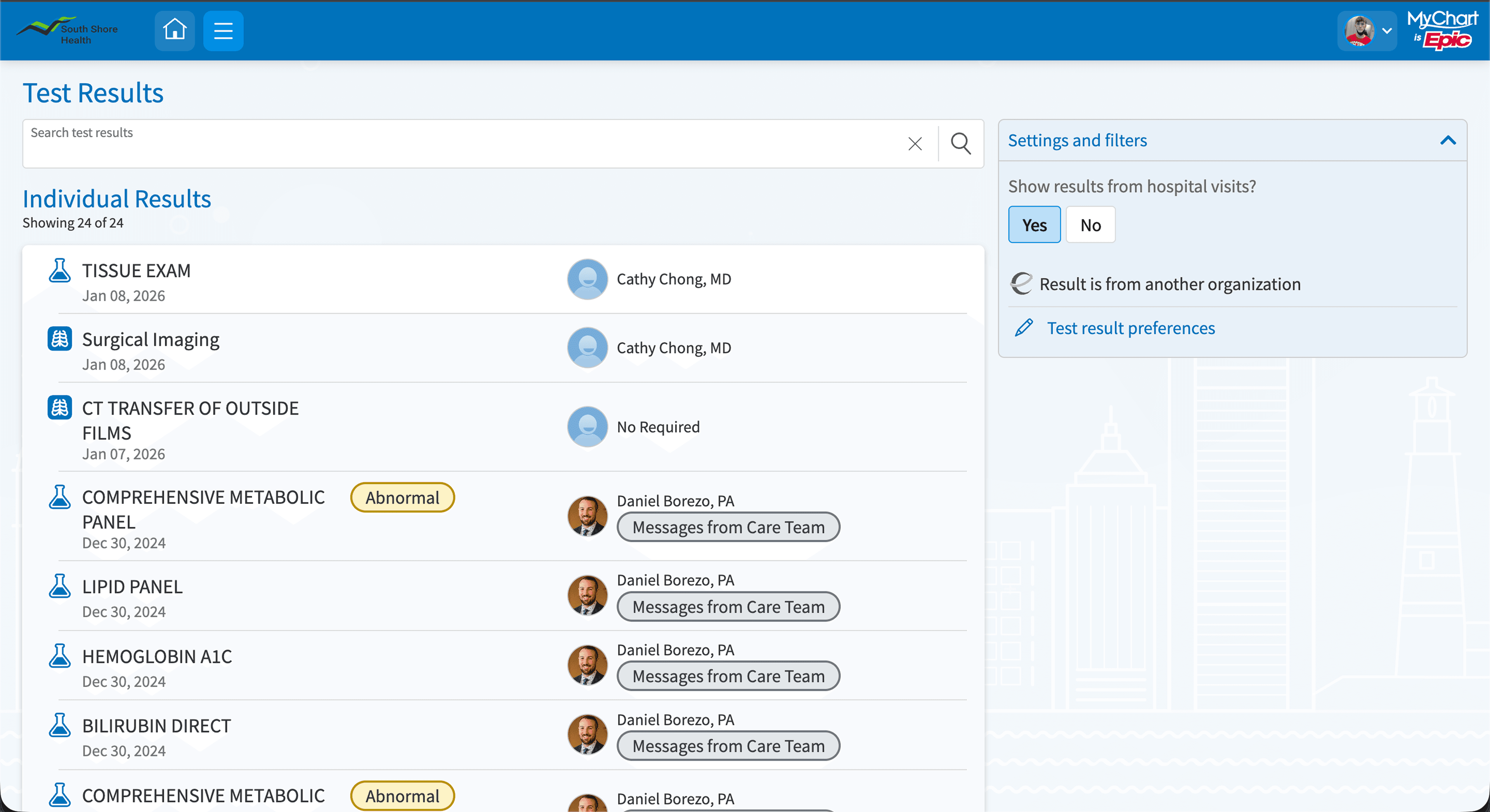
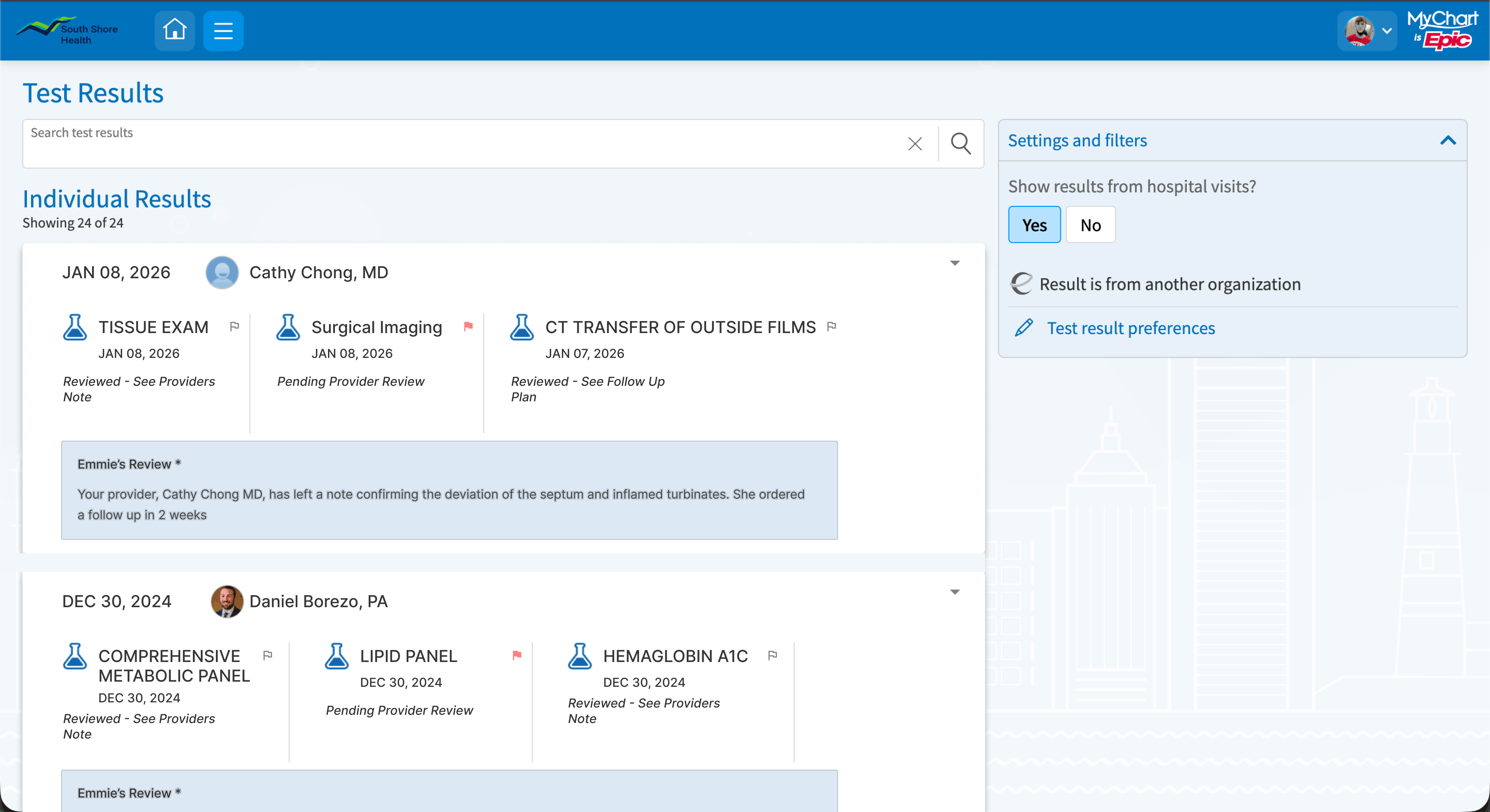
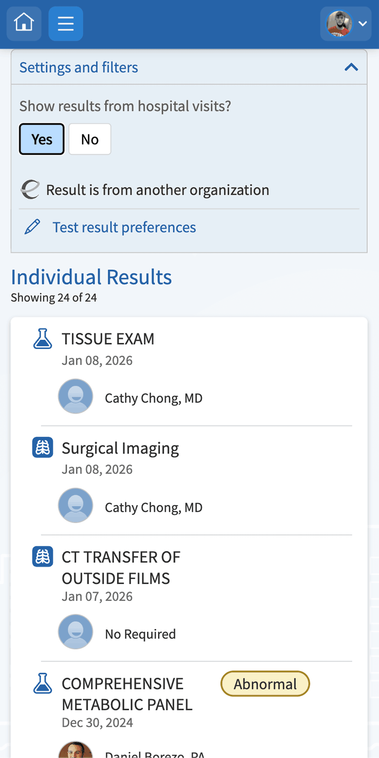
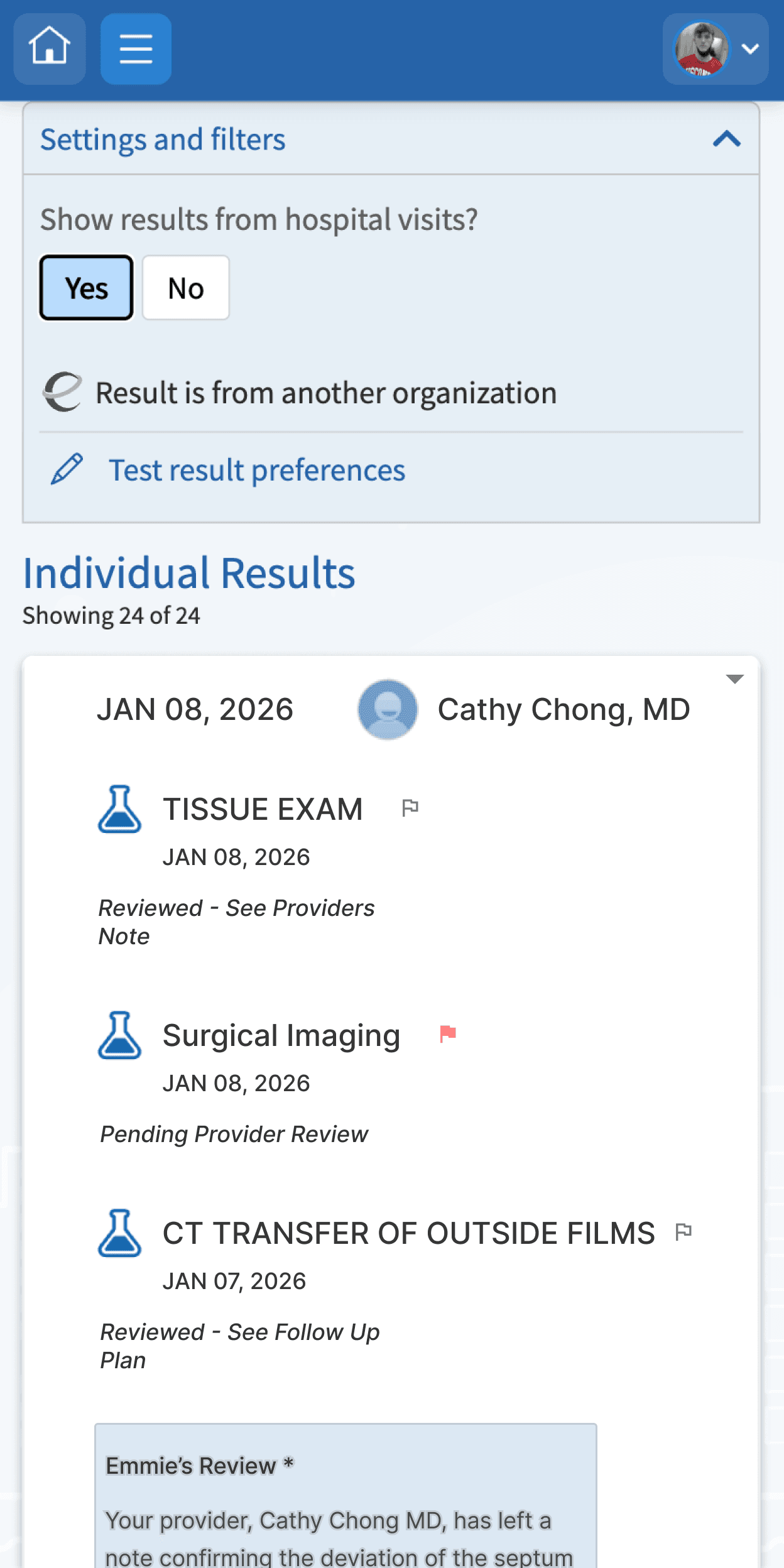
A1. Visit-level grouping
Instead of 24 individual line items, results are grouped into collapsible visit cards. The card header shows date, result count, flag count, and provider review status, and surfaces a preview of the doctor's note before the patient expands it. This directly addresses the finding that patients' worst anxiety comes from not knowing whether anyone has looked at their results yet.
Tradeoff: Grouping by visit means a patient tracking cholesterol over 6 months opens 6 cards instead of seeing a single trend line. That's a real cost, which is why I included a "view by test type" toggle as a secondary view. The anxiety problem is more urgent than the tracking problem, so visit-level grouping is the right default.
Before (desktop)
After (desktop)
Before (mobile)
After (mobile)
A2. Context-aware status badges
The binary "Abnormal" badge is replaced with three states that communicate what actually matters to a patient: "Reviewed — see provider's note" / "Provider has a follow-up plan" / "Pending provider review."
The third state is the most important addition. It currently doesn't exist in MyChart, which means patients have no way to distinguish "my doctor saw this and isn't concerned" from "my doctor hasn't looked at this yet." That gap drives a large volume of unnecessary inbox messages to providers.
I considered the NHS traffic-light approach but their own redesign history showed color-only systems fail for colorblind users and older adults. These badges are text-first, with color as a secondary signal. Critically, they communicate provider status, not just clinical status. A flagged result can still carry a reassuring badge if the doctor has reviewed it.
A3. Flag results for next appointment
No competitor currently offers this. I kept flags patient-side only in v1 to avoid adding to provider inbox volume, with sharing as a natural follow-on feature if testing shows patients want it.
Set B: AI-powered interpretation layer
Epic already has Emmie (patient-facing AI chatbot), AI imaging summaries, and Art (clinician AI used 16M+ times per month). This solution extends those existing capabilities into lab results, where the research shows the highest patient anxiety and the most patients leaving the portal for third-party AI tools.
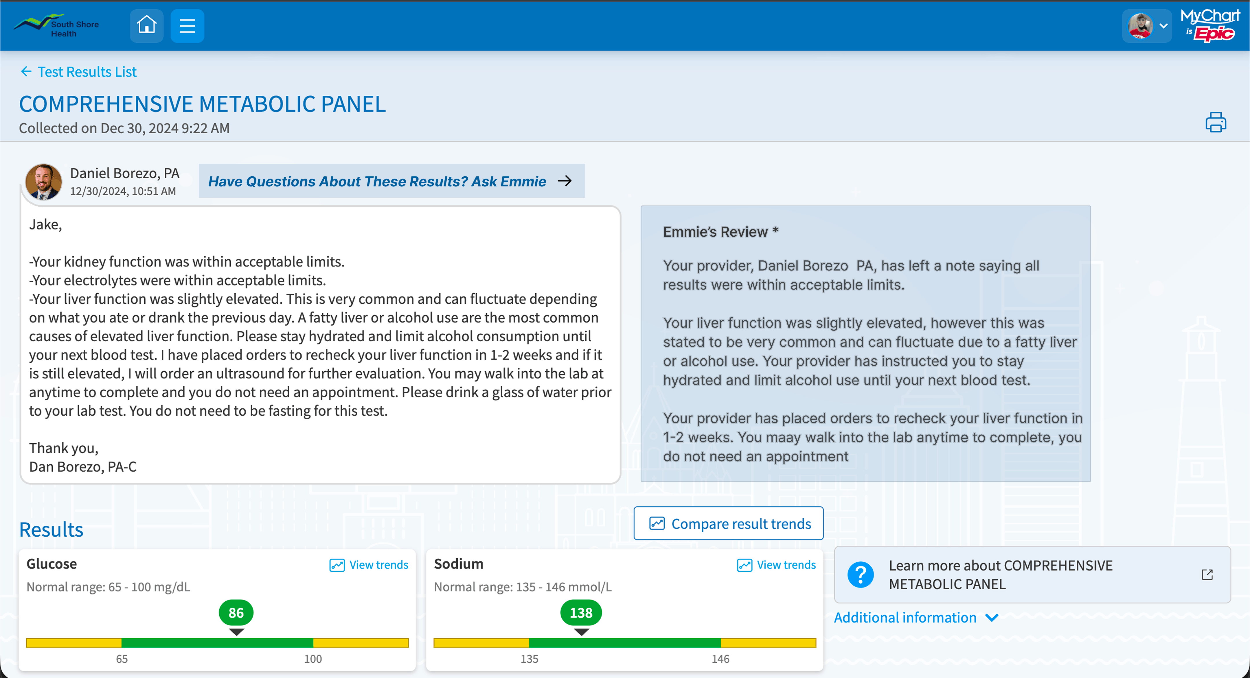
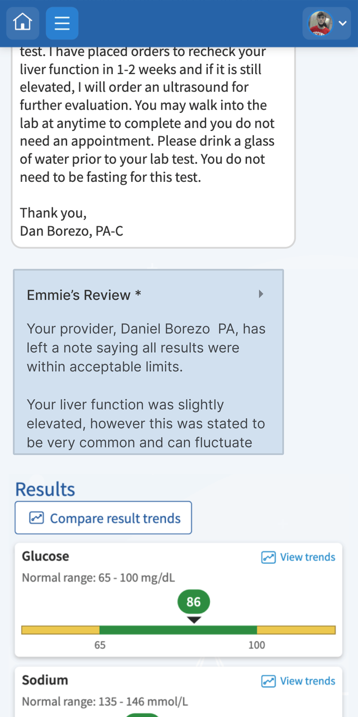
B1. AI-generated visit-level summary
A plain-language summary appears at the top of each visit card: "Your Dec 30 blood panel came back mostly normal. Two liver markers were slightly above the typical range. Your provider left a note explaining this is common and can fluctuate with diet. He ordered a follow-up in 1-2 weeks."
When no provider note exists yet, the summary is strictly factual. No interpretation, no reassurance, nothing that could pass for clinical judgment. False reassurance is the highest-risk failure mode in healthcare AI, so the guardrail is clear: the AI bridges the clinical data and the provider's note, it never replaces either.
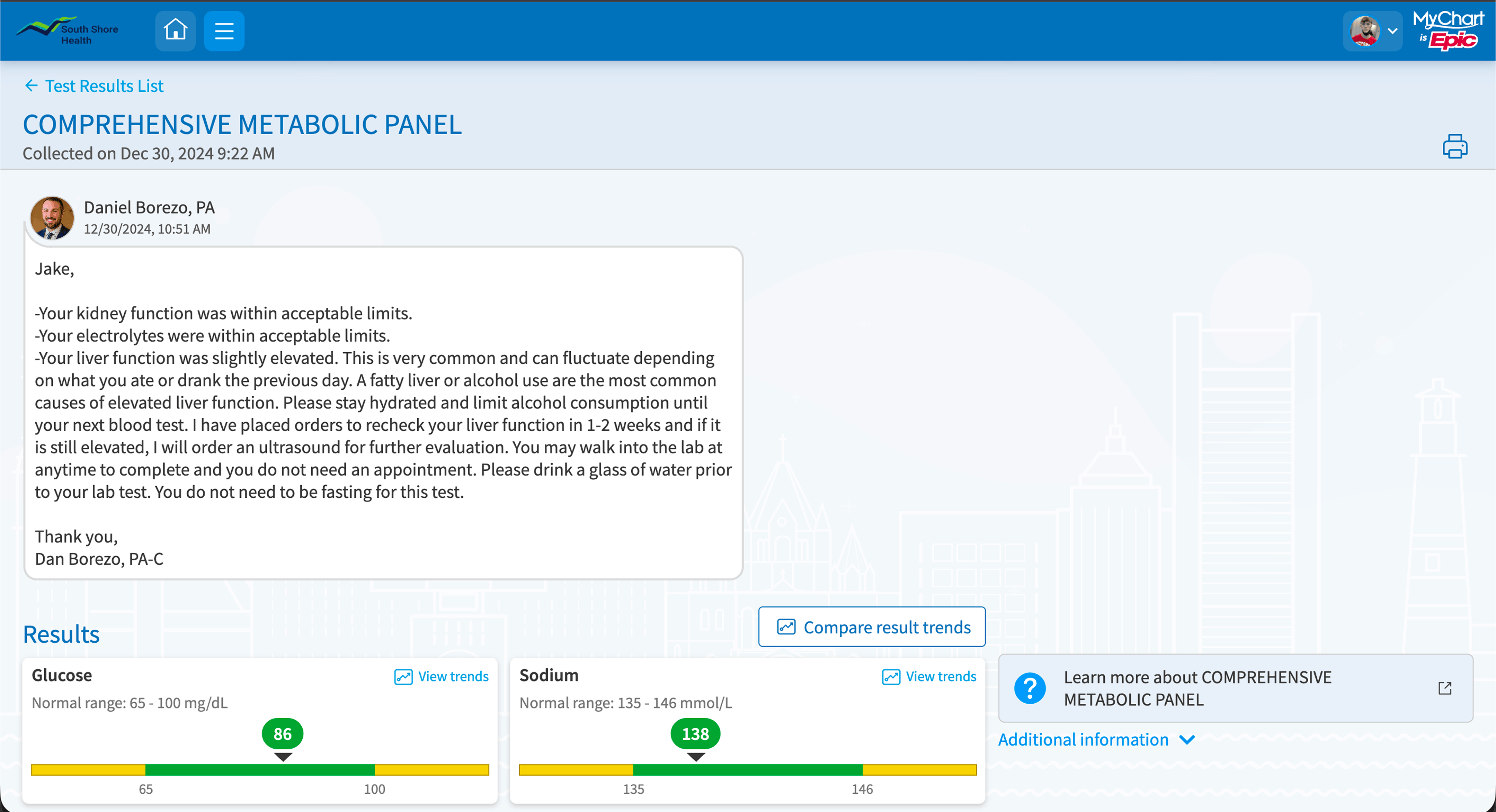
Before (desktop)
After (desktop)
Before (mobile)

After (mobile)
B2. Contextual "What this means" per result
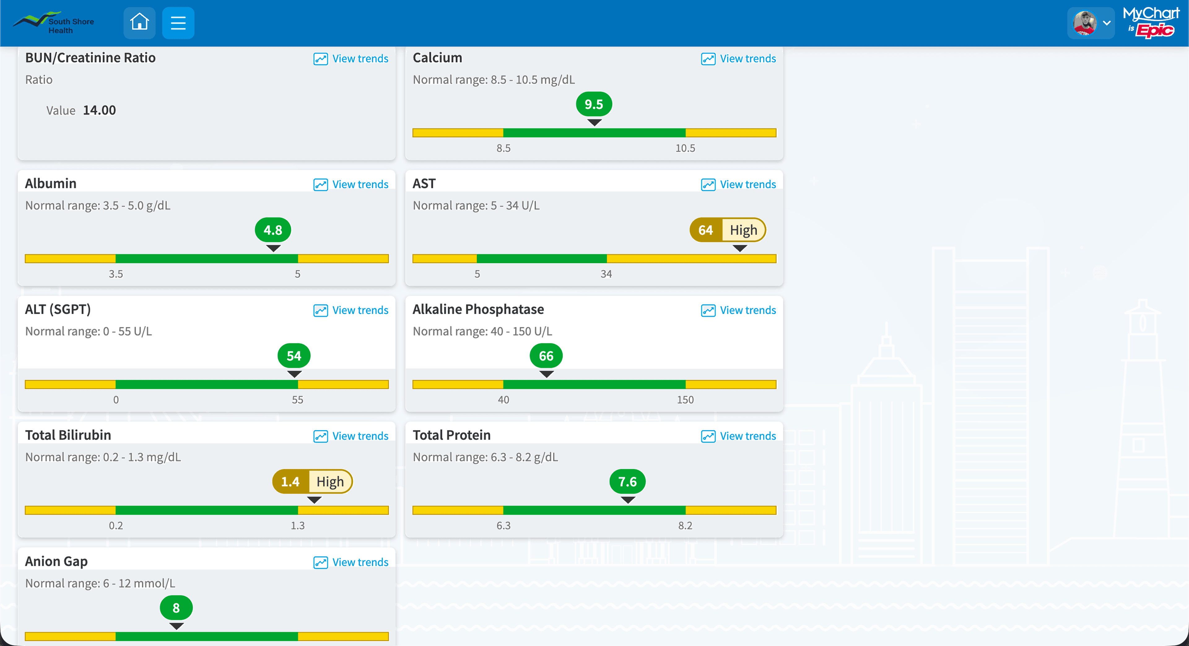
The current "Learn more about COMPREHENSIVE METABOLIC PANEL" link sends patients to a generic education page. That's the digital version of spending two hours with a medical dictionary. This replaces it with a result-specific explanation tied to the patient's actual value, pointing back to the provider's note. The question patients have is "what does my number mean," not "what is this test."
Before (desktop)
After (desktop)

Before (mobile)
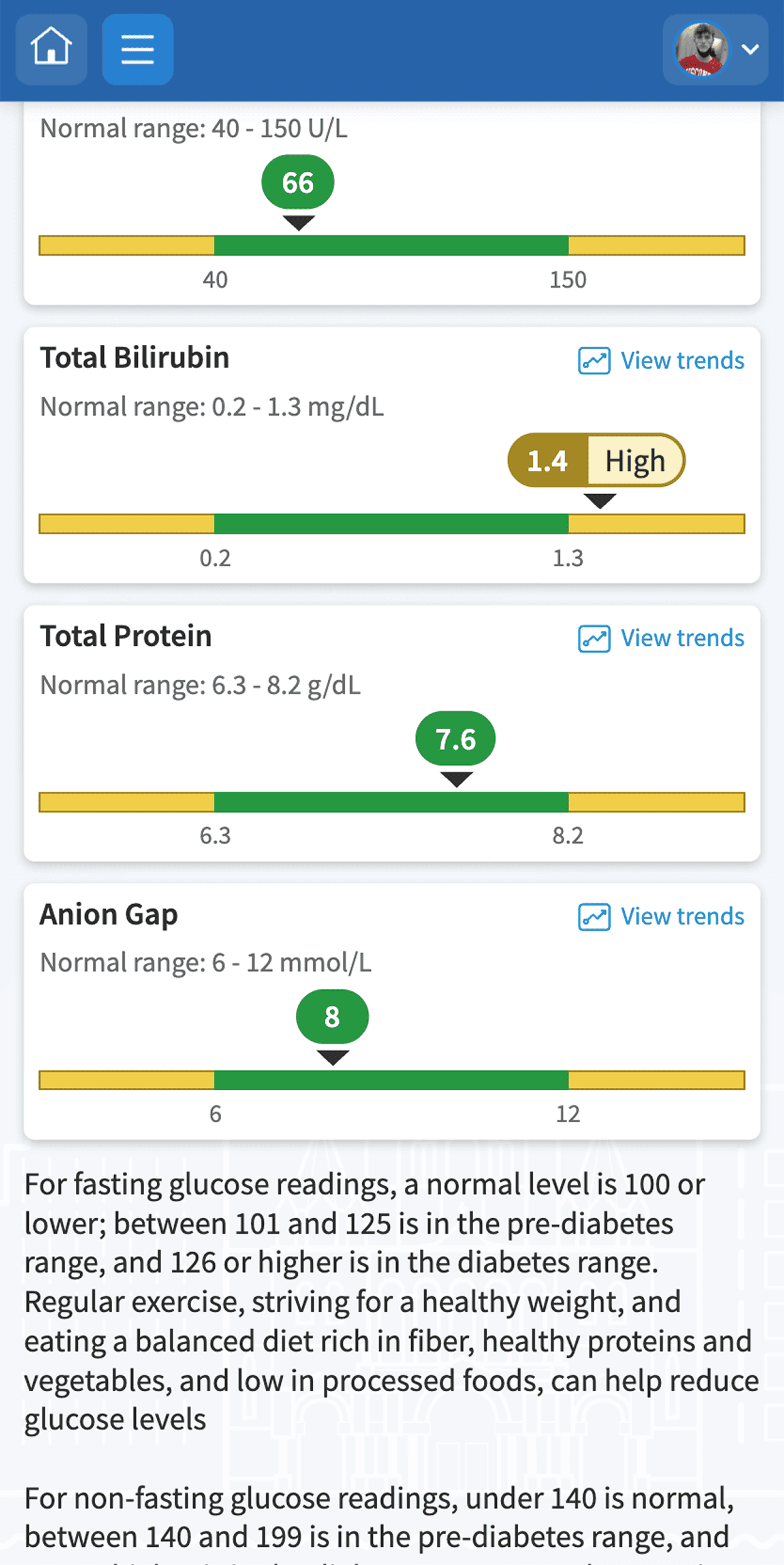
After (mobile)
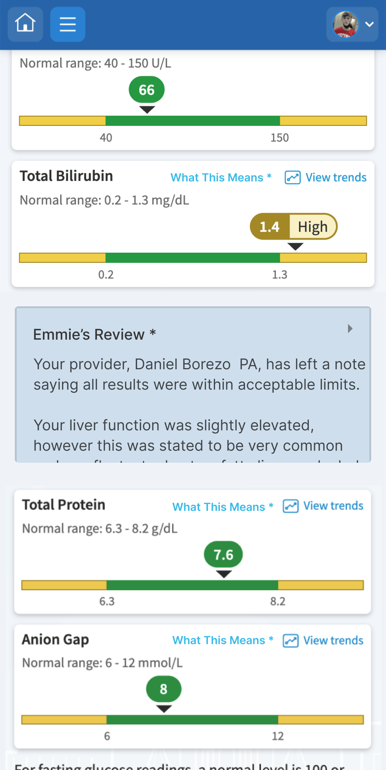
B3. Inline Emmie prompt
Emmie is surfaced directly on the results page as a safety net, after the patient has read the summary and provider note. The interface answers the most common questions first through the summary and contextual notes. Emmie handles what's left.
Key decisions
The most consequential decision was replacing the "Abnormal" badge. I couldn't remove it entirely since patients need to know when something is flagged. The core insight was that the badge needs to communicate provider status, not just clinical status. MyChart currently has no way to show that distinction at all.
The hardest constraint was the AI layer. Summaries in a healthcare context carry real liability. The design keeps the AI in a supporting role: it contextualizes, points to the provider, and stays strictly factual when no note exists yet.
What I'd measure
- Provider inbox volume for result-related messages (target: fewer "what does this mean?" messages; result-action messages should hold steady or increase)
- Time-to-comprehension, measured in usability testing against the current design
- Patient-initiated messages within 24 hours of result release (target: flatter spike, more specific questions)
- Portal avoidance via notification-to-login rate
- Patient confidence via an optional one-question pulse survey after viewing results
What I'd test first
Round 1: The "Abnormal" badge. Three variations against the current control: Clinical + Context / Status-Led / Action-Oriented. Between-subjects, 15-20 participants across age groups and health literacy levels. Looking for the version that lowers anxiety without reducing comprehension.
Round 2: Visit-level grouping vs. flat list. Task-based: "Find the two flagged results and tell me what your doctor said." The signal I'm looking for is whether participants naturally summarize the big picture without being prompted. If they do, the grouping is working.
Round 3: AI summary tone. Factual/Neutral vs. Reassuring/Contextual vs. Action-Oriented. Looking for the version that lowers anxiety without causing patients to skip the provider's note entirely.
Full research documentation, competitive analysis, and wireframe specifications available on request.
Full case study (PDF)
This page is the condensed case study. For a printable deep dive, use the full PDF.
Read the full case studyOpens a PDF in a new tab.