Spotify UX Redesign
Note: The data presented here is simulated and demonstrates what improvements like these might bring to user experience metrics.
Project Overview
This case study explores a redesign of Spotify's interface to address user pain points around navigation, content discovery, and playlist management. The project included extensive user research, wireframing, prototyping, and visual design phases.
The redesign aims to improve the overall user experience while maintaining Spotify's brand identity and aesthetics. Key improvements focus on streamlining the navigation structure, enhancing content discovery features, and making playlist management more intuitive.
Key Improvements
Simplified navigation structure
Easier access to key features
Enhanced content discovery
Improved recommendation algorithms
Redesigned player interface
Better usability across devices
Streamlined playlist management
Intuitive controls
Consistent design language
Across desktop and mobile platforms
Project Details
My Role
UX/UI Designer, User Researcher
Tools Used
Figma, Adobe XD, Usability Hub
Deliverables
User Research, Wireframes, Hi-Fi Mockups, Interactive Prototypes
Case Study
Overview

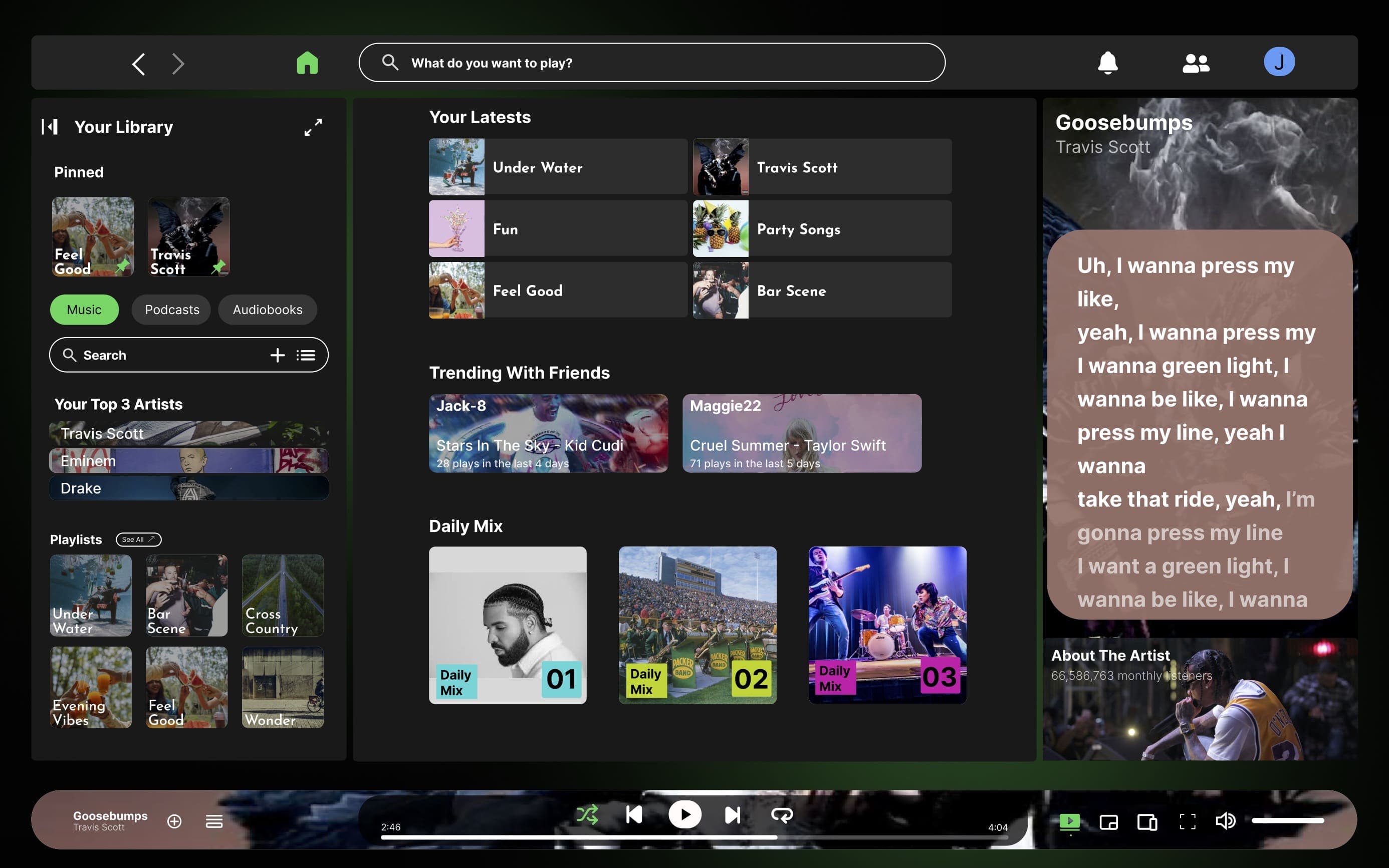
Desktop Home - Redesigned

Mobile Home - Redesigned
Before & After
Desktop - Before

Desktop - After

Mobile - Before

Mobile - After

User Flow

Desktop Breakdown - New Design

Mobile Breakdown - New Design
PROBLEM STATEMENT
Despite Spotify's popularity, users reported difficulties with navigation, content discovery, and playlist management. The challenge was to redesign the interface to address these pain points while maintaining the platform's familiar feel and brand identity.
RESEARCH METHODOLOGY
The research phase involved user interviews, competitive analysis, and usability testing of the existing interface. Key findings revealed that users struggled with:
- Finding specific content in large libraries
- Navigating between different sections of the app
- Managing playlists efficiently
- Discovering new music beyond algorithmic recommendations
DESIGN PROCESS
The design process followed a user-centered approach with the following steps:

Design Planning and Process
KEY SOLUTIONS
SIMPLIFIED NAVIGATION
Reduced the number of primary navigation items and reorganized the information architecture
ENHANCED SEARCH
Improved search functionality with filters and contextual results
CONTENT DISCOVERY
Added curated content sections and personalized recommendations
PLAYLIST MANAGEMENT
Redesigned playlist creation and editing workflows
CROSS-PLATFORM CONSISTENCY
Ensured design consistency across desktop and mobile platforms
RESULTS & IMPACT
Usability testing with the new design showed significant improvements:
Design Principles
Simplified Navigation

Enhanced Search

Content Discovery

Playlist Management

Cross‑Platform Consistency

Conclusion
The Spotify redesign project successfully addressed key user pain points while maintaining the platform's core identity. Through careful research, iterative design, and user testing, the new interface provides a more intuitive and enjoyable experience.
Key achievements include a simplified navigation structure, enhanced content discovery features, and improved cross-platform consistency. User testing validated these improvements with significant gains in task completion times and overall satisfaction.
This case study demonstrates how thoughtful UX design can enhance an already successful product by focusing on user needs and pain points, ultimately leading to a more engaging and satisfying experience.